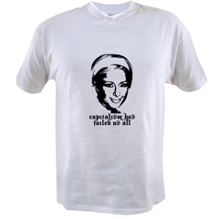
Locus Solus Industries continues apace. Here is our second t-shirt:

Also suitable for many occasions, perhaps even more than the last one.
But: alas. Say the good people at Cafepress:
Dear Shopkeeper,
Thank you for using CafePress.com!
As you may know, CafePress.com provides a service to a rich and vibrant community of international users. From time to time, we review the content in our shopkeepers accounts to confirm that the content being used in connection with the sale of products are in compliance with our policies, including our Content Usage Policy (CUP).
We recently learned that your CafePress.com account contains material which may not be in compliance with our policies. Specifically, designing, manufacturing, marketing and/or selling products that may infringe the rights of a third party, including, copyrights (e.g., an image of a television cartoon character), trademarks (e.g., the logo of a company), “rights in gross” (e.g., the exclusive right of the U.S. Olympic Committee to use the “Olympic Rings”), and rights of privacy and publicity (e.g., a photo of a celebrity) are prohibited.
Accordingly, we have set the content that we believe to be questionable to “pending status” which disables said content from being displayed in your shop or purchased by the public.
You may review the content set to pending status by logging into your CafePress.com account and clicking on the “Media Basket” link. The content set to pending status will be highlighted red.
Please visit our Content Usage Policy (CUP) for additional information regarding your use of the CafePress.com service. Once there, you may access our Copyright, Trademark & Intellectual Property Guidelines and FAQ’s for more detailed information regarding Intellectual Property Rights.
We apologize for any inconvenience that the removal of your content may have caused you. Please let us know if we can be of further assistance.
Sincerely,
Content Usage Associate
CafePress.com
CUP@cafepress.com
this is very funny!
too bad, i wanted #2. capitalism works fast.
why all the fraktur gothic font though?
The Fraktur is mostly because that particular font, Newcastle, seemed like it would degrade well if poorly printed, as I suspect these things are. You can’t really see it on the thumbnails, and I haven’t actually seen any of the shirts, so I don’t know if that’s actually true. But it does have a lot of lovely little curly-cues on it that you don’t usually see on a blackletter font. It’s nicely confused.
Pingback: with hidden noise » Blog Archive » locus solus industries 003